|
Piglet
|
 |
« Reply #30 on: January 22, 2008, 08:16:16 pm » |
|
I like Barry's idea for the back of the shirt. I'm not keen on other "funny" comments, it's too difficult to get something that actually is funny and not just stooopid!
I'd vote for leaving the front the same, let's not re-invent the wheel for the sake of it.
|
|
|
|
|
 Logged
|
|
|
|
|
nickliv
Guest
|
|
« Reply #31 on: January 22, 2008, 08:46:01 pm » |
|
An Alka Seltzer in a champagne glass?
|
|
|
|
|
Logged
|
|
|
|
|
Perdu
|
|
« Reply #32 on: January 22, 2008, 11:00:03 pm » |
|
OK I done some real wikked Photoshoppery to change the image (Paint Shop Pro 4 atcherrley) in line with my earlier brilliant suggestions yukkkk  forget I spoke, the original looks more dramatic maybe a thinning out of the track surface shade density to get a defined picture of the car, apart from that I like wot Delboy did first off. bill |
|
|
|
|
Logged
|
"Ha ha you can't a fool me, there ain't a no sanity clause!"
|
|
|
|
Chris24
|
|
« Reply #33 on: January 22, 2008, 11:10:28 pm » |
|
I still think the Jag would be more fitting with the anniversary, Jan lammers, and the Group C Race. Also it would make me buy one again having decided to give last years a miss.
|
|
|
|
|
Logged
|
|
|
|
|
DelBoy
|
|
« Reply #34 on: January 22, 2008, 11:21:18 pm » |
|
I would like to suggest an alternative to the car design on the back.
I really liked the idea of the LM clock on the back, prehaps with it showing one minute to 4, ( or 3 if we wish to be up to date), with the 'Racing is life. Anything before or after is just waiting' quote underneath.
I liked the idea of the clock for the calendar, but I'm not too keen on the current one. Anyway, no-one had a decent picture of it, either the old one or the current one. Del |
|
|
|
|
Logged
|
Team Delboy Racing
|
|
|
|
Barry
|
|
« Reply #35 on: January 22, 2008, 11:37:06 pm » |
|
There is a nice 2 colour image on the inside cover of Brian Laban's book of the 24 Hour, which I think is intresting.
Now whether people like it, and the guys who are good at tweeking pictures could make it work on a 'T', I don't know.
I cannot see a copywrite reference in the book, although if we wanted to use it we would need Brian's permission, we did succeed with 2 beers.
Does anyone know Brian Laban?
|
|
|
|
« Last Edit: January 22, 2008, 11:55:31 pm by Barry »
|
Logged
|
|
|
|
|
Lee Self
|
|
« Reply #36 on: January 23, 2008, 12:09:30 am » |
|
I remember saving this when it went past in another thread months ago. everybody seemed real keen on it at the time. -Lee  |
|
|
|
|
Logged
|
|
|
|
|
Lee Self
|
|
« Reply #37 on: January 23, 2008, 12:22:58 am » |
|
here's a quick hack job. -Lee  |
|
|
|
|
Logged
|
|
|
|
|
garyfrogeye
|
|
« Reply #38 on: January 23, 2008, 12:51:50 am » |
|
Nice  |
|
|
|
|
Logged
|
If I was you, I wouldn't start from here
|
|
|
|
Lee Self
|
|
« Reply #39 on: January 23, 2008, 01:06:35 am » |
|
Nice thank ya, thank ya very much  |
|
|
|
|
Logged
|
|
|
|
|
Paddy_NL
|
|
« Reply #40 on: January 23, 2008, 09:53:03 am » |
|
Thanks for the reminder, Lee. But there are problems all over with that design. First of all, the diagonal stripes cannot cover the shirt completely, as most printers normally have a standard oversized A3 -rack (400 x 300 mm) to print on. It is possible to print completely, but that would raise the printing price substantially. Seconly there is the colour of the stripes. Originally the blue should be left and red should be right, so the stripes eventually become more like a French flag instead of a Dutch flag. I do not believe the majority of the CA-people would like their own shirt to become Dutch as most are all English. A shirt with the coloured striping the original way would look like this: 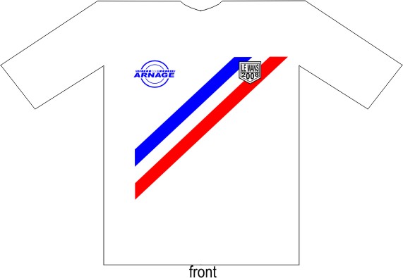 Working in that same way, but then with a Union Jack, maybe it could look like this: 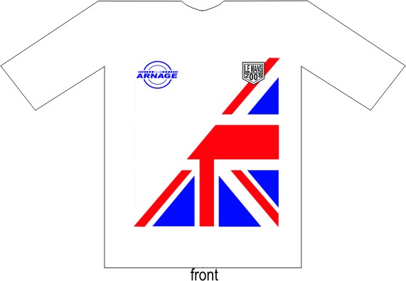 |
|
|
|
|
Logged
|
Paddy's 2009: Spa LMS NBR 24 Le Mans 24 Spa24 NBR LMS Silverstone LMS =( Drinking for Holland  |
|
|
|
Werner
|
|
« Reply #41 on: January 23, 2008, 09:55:44 am » |
|
Please leave the stripes on the front of teh t-shirt as they have been the last year
Cheers
Werner
|
|
|
|
|
Logged
|
"
to be honest, I did it purely for the money at first. I went to Le Mans
hoping that the car would break down. I came away in love with the place." - Eddie Irvine
|
|
|
|
Paddy_NL
|
|
« Reply #42 on: January 23, 2008, 10:02:46 am » |
|
I think it looks nicer with the CA Logo on the left breast (above Le Mans at the top of the red/white/blue stripe)
I think that is how we had them in 2004 and 2005??
That should be like this then...  |
|
|
|
|
Logged
|
Paddy's 2009: Spa LMS NBR 24 Le Mans 24 Spa24 NBR LMS Silverstone LMS =( Drinking for Holland |
|
|
|
Kev_mk3
|
|
« Reply #43 on: January 23, 2008, 10:07:55 am » |
|
I think it looks nicer with the CA Logo on the left breast (above Le Mans at the top of the red/white/blue stripe)
I think that is how we had them in 2004 and 2005??
That should be like this then... I love the union jack idea but TBH I think the one I have quoted will be better to mass produce. Im thinking of the guys who have to make them / order them. If you stick to 1 universal t shirt it will save mistakes ( not that your going to make any! ) |
|
|
|
|
Logged
|
|
|
|
|
Paddy_NL
|
|
« Reply #44 on: January 23, 2008, 10:16:29 am » |
|
Im thinking of the guys who have to make them / order them. If you stick to 1 universal t shirt it will save mistakes ( not that your going to make any! )
Nothing to do with the end result, but for the third consecutive year we will change printers  |
|
|
|
|
Logged
|
Paddy's 2009: Spa LMS NBR 24 Le Mans 24 Spa24 NBR LMS Silverstone LMS =( Drinking for Holland |
|
|
|


 Poll
Poll
